I like how you have experimented on your photos because you have shone what a lovely photo looks like in black and white.
Callum Griffiths-Jones
Friday, 24 May 2013
Review
i like your photos i think they are effective and that they catch the attention of the audience i think that they have been edited to a high standard and that they are taken from really good angle
stacey harris
stacey harris
Review
I love your pictures, I think that they are all of a high standard and look professional. The black and white theme is good because you have used many different ideas and incorporated them into the theme. I think the friendship theme is good because you have used different angles and editing skills within all the pictures.
Natalie Bradshaw.
Natalie Bradshaw.
Review
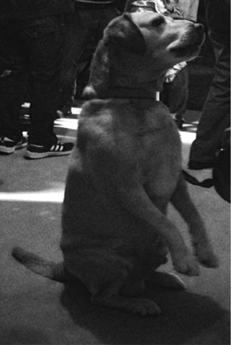
I like the black and white theme on your dog photo because I think it gives it a good affect and makes it stand out from other photos.
Kyle Arnold
Kyle Arnold
Review
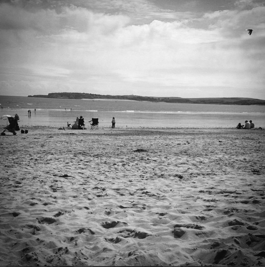
The photo that I love is the beach theme, this is because it catches my eye and has a clear main subject.
Mitchell Boswell
Mitchell Boswell
Wednesday, 22 May 2013
Review
I think sian has taken alot of time to create a good blog of images, all of her photos are very well formatted and taken. her photos are very creative.
Sarah Lewis.
Sarah Lewis.
Review
I think that Sians images are good because she took her time taking them which had made all of her images look great.
Chantelle Dumayne.
Chantelle Dumayne.
Black and White Theme - Beach

Friday, 10 May 2013
Black and White Theme - Dog

Black and White Theme - Queens College


Wednesday, 8 May 2013
Black and White Theme - Daffodil


My photograph differs from the professional one as my background is not solid black but is just a normal background that is out of focus and has been changed to black and white. Also my photograph is more of a birds eye view of the flower instead of a straight on close up.

Friday, 3 May 2013
Black and White Theme - Lamp


Black and White Theme - Bluebells


Black and White Theme - Sign


Monday, 29 April 2013
Black and White Theme - Lanterns


Friday, 26 April 2013
Netball Theme - Netball trainers


Netball Theme - Chest pass


Netball Theme - The ball


Netball Theme - Overarm throw


Netball Theme - Watching the ball


Wednesday, 24 April 2013
Netball Theme - Standing either side of the ball


Netball Theme - Preparing to shoot

I cropped this photograph so that only the key features were apart of it and decreased the brightness level to get the photograph darker but left the contrast level as neutral so that certain aspects of the photograph would look as though to be glowing.

Netball Theme - On the ball

I took this photograph because it shows that the player is in control of the ball and the game. I like this photograph because it is so simple, has so much detail within it and easily relates to my chosen theme.
I cropped this photograph so that only the features necessary for the photograph were in it. I also changed the photograph so that is was in black and white, I did this because it makes the photograph look more professional and more interesting.

This is my original photo before I edited it.
Friday, 15 March 2013
Friendship Theme - Passing a Tissue

I cropped this photograph so that there wasn't unnecessary background and so that the photograph was focused on only the feature that is important, the passing of the tissue.

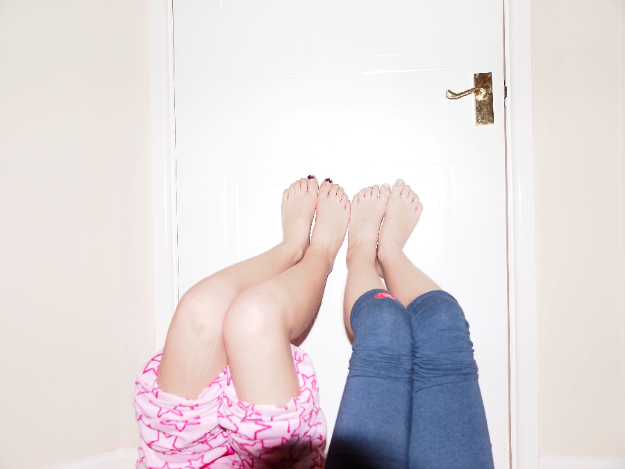
Friendship Theme - Feet

I edited this photograph by cropping out the legs and the unnecessary background. I also used the Spot Healing tool to remove the nail varnish off the toes nails to make the feet look younger and more innocent.
Friendship Theme - Pinky Swear

The brightness of the photograph gives it a light and upbeat aspect.
I cropped this photo so that only the main feature, the hands were visible and so that there wasn't too much going on.
I used the highest flash intensity on the camera to make the image so bright.

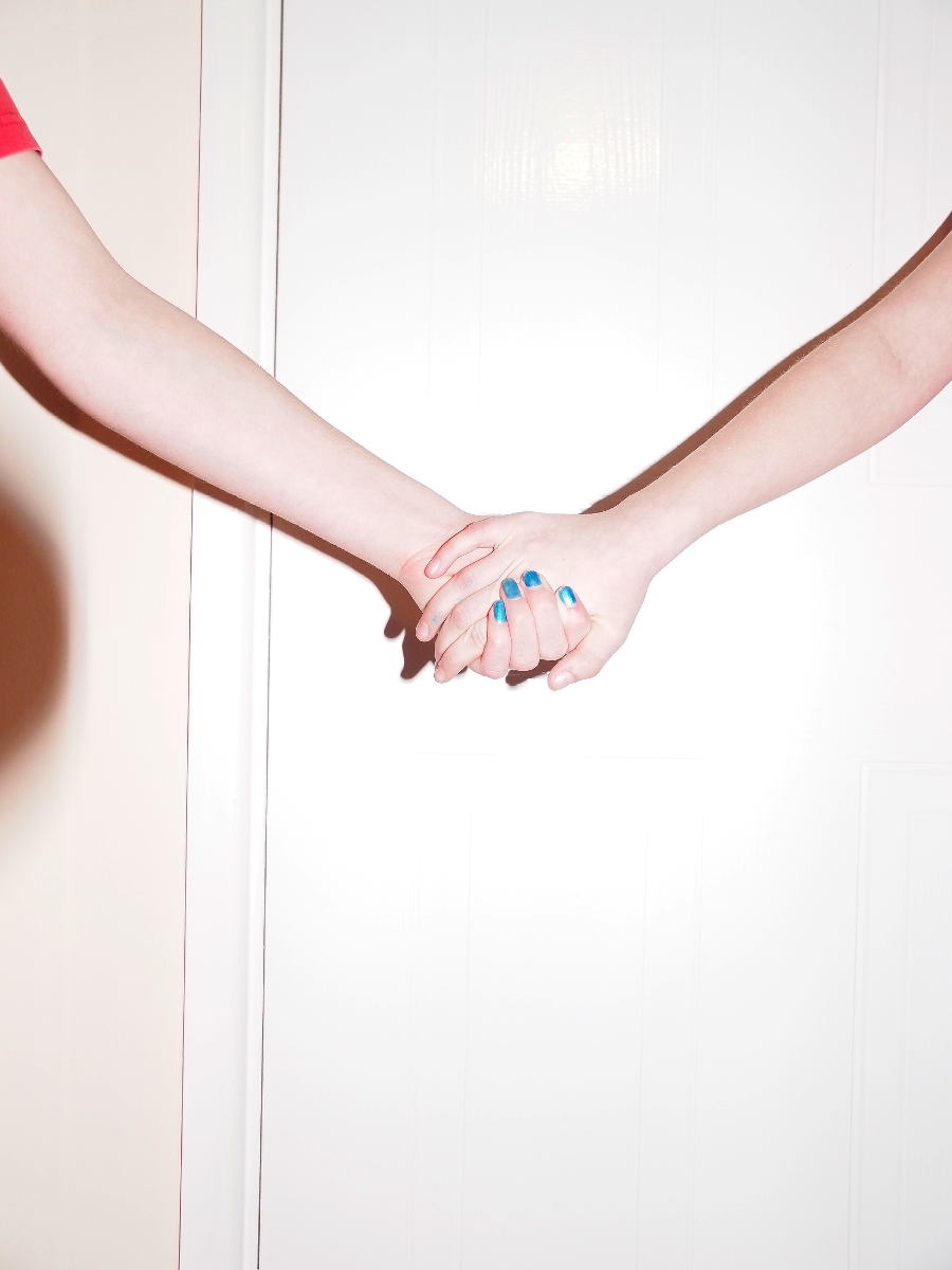
Frienship Theme - Holding Hands

I like this image as it is so bright and clear. The brightness of the photograph presents it in a happy and positive light.
The photograph is so light as I used the highest intensity flash that the camera offered. The only changes i made to the photograph was cropping out unnecessary background in order to have the photograph only focusing on the hands.
Wednesday, 13 March 2013
Friendship Theme - Balloons

I edited this photo by outlining the balloons so that when I adjusted the hue and saturation levels, it wouldn't affect them. On the rest of the image I used the hue and saturation sliders to change the levels and end up with the rest of the image in a darker light. I wanted the rest of the photograph to be duller so that the balloons stood out, I think that by having the rest of the photograph darker it makes the balloons look much brighter than they actually are. I also think that the balloons add a fun aspect to the photograph as they are so bright. I like this image because although it is so simple, by editing the photograph it makes it look a lot more interesting. I also cropped the photograph so that there were no unnecessary objects in the image and it was focused on only the main features (the girls and the balloons).

Friday, 1 March 2013
Using a filter
-->
I used one of the filters on Photoshop to edit my photograph. I used the Smudge Stick tool because it brightened the whole image and so more of the details came through. I played with a lot of the different filters but came to a conclusion that the Smudge Stick tool looked the best. I also used the sliders on the Stroke Length, Highlight Area and Intensity bars to adjust how the Smudge Stick tool was applied to my photograph. I chose to edit this image as originally it was very dark and was boring to look at, by adding a filter, I’ve made the image lighter and more interesting as you are able to see more detail. By increasing the light intensity on the photograph I am also uplifting the mood of the piece, friendship is a very light and upbeat theme and so now the photograph matches the theme.
 -->
-->
 -->
-->
I used one of the filters on Photoshop to edit my photograph. I used the Smudge Stick tool because it brightened the whole image and so more of the details came through. I played with a lot of the different filters but came to a conclusion that the Smudge Stick tool looked the best. I also used the sliders on the Stroke Length, Highlight Area and Intensity bars to adjust how the Smudge Stick tool was applied to my photograph. I chose to edit this image as originally it was very dark and was boring to look at, by adding a filter, I’ve made the image lighter and more interesting as you are able to see more detail. By increasing the light intensity on the photograph I am also uplifting the mood of the piece, friendship is a very light and upbeat theme and so now the photograph matches the theme.

This is my photograph after
adding the filter.

This is my original
photograph before being edited.
Rule of Thirds
-->

I took my own photograph that followed the Rule of Thirds. This image follows the Rule
of Thirds because the main focus of the photograph is to the left of the image
instead of having it in the middle. By having the main feature off centre, the
image has become more interesting because you can see more of the background
but also because it is not like a typical photograph (which only focuses on the
middle of the image), it is unusual. It is also much more interesting because
the main features (the girl’s faces) are not just placed to the side but are
placed methodically so that they lie on either junctions or on lines that
demonstrate the Rule of Thirds. I used Photoshop to add in the lines that
represent the Rule of Thirds. I like this photograph because of its simplicity
but how it still follows my theme of friendship. I chose to take this image
because not only will it clearly demonstrate the Rule of Thirds but it also
shows friendship in its simplest form, childlike and fun. To improve this photograph, I could have made it lighter in order for even more details to be seen.

This is my photograph after adding the lines to symbolize the Rule of Thirds.
 This was my original photograph without the lines symbolizing the Rule of Thirds.

Friendship
This photograph inspired me to pick the theme
of friendship. I chose the theme of friendship because I thought it was a
positive and happy topic and there are endless possibilities to express
friendship through a range of images. I also chose friendship because I think
that the photographs that represent friendship are really interesting to look
at. I chose this image because I think it truly represents friendship as the
two boys are so relaxed and at ease with one another. I also chose this image,
as they seem so comfortable with each other as though they are brothers. I
found this image on Google.

This is my interpretation of the original photograph. I chose to take a photograph of my sisters because the two boys are like brothers in the original photograph and so my photograph will relay the relationship portrayed originally. I turned my photo black and white using Photoshop; I also turned my image darker than the original one by using the tools on Photoshop. My photograph is also much bigger than the original so you can see more of the people within my image.

This is my interpretation of the original photograph. I chose to take a photograph of my sisters because the two boys are like brothers in the original photograph and so my photograph will relay the relationship portrayed originally. I turned my photo black and white using Photoshop; I also turned my image darker than the original one by using the tools on Photoshop. My photograph is also much bigger than the original so you can see more of the people within my image.

Friday, 8 February 2013
Rule of Thirds
The rule of thirds is known
as the “rule of thumb”. It applies to the process of creating photographs (or
paintings or designs). The guidelines divide the image into nine equal parts so
that important elements are placed along the guidelines or their intersections.
The intersections are where the horizontal and vertical lines cross. The rule
of thirds creates more tension, energy and interest in the image, as the image
is not centred but slightly to one side.

The rule of thirds, a photograph with the guidelines. The bee’s eye is placed on an intersection,
as it is an important element. The image is based to the right instead of
centred; this is more interesting as there is only a limited space for
background instead of having a plain background on both sides of the main focus
of the photograph.

The rule of thirds without the guidelines. The main element
of this image is the hut to the right of the image. This is interesting because
it is a shot of the landscape but still holds a key feature (the hut) within
the photograph without making the image all about the hut.


Subscribe to:
Comments (Atom)